Kitchen Design Honors Historical Home’s Roots
In 2016, Bethanie and Kurt Rames found their forever home in Omaha. Originally built in 1940, the grand 5,000+ square foot house is set back on 90th Street between Dodge and Pacific Streets. The house had character for days, which was the reason they fell in love with it. “The faded red brick, the marked lines for the growth of children that lived in the house before, the big school bell out back–all of that,” Bethanie said.
As is the case with many older homes, the house needed work. “It was a complete mess when we moved in,” Bethanie said. “We had no hot water in the kitchen; we were flushing the upstairs toilet with pliers for months, and at one point water was raining down on us in the garage.”
Having owned and renovated rental homes, the Rameses spent the next couple of years doing much of the work themselves. The kitchen, which had been pieced together over time with the latest update from the 1990s, required calling in reinforcements.
Bethanie knew this was her chance to do something different for interior design from the neutrals she used at their rentals but worried about making a mistake. “I’m not good at visualizing how things are going to work,” she said. They hired Jamy Clark at Walls 2 Floors as their contractor and trusted his recommendation to call on Designer Mary Ritzdorf at JH Interior Design.
When Mary first walked into the home, she was blown away. “The exterior was so stately and the original woodwork in the entry was stunning,” she said.
The Rameses were equally impressed with Mary and appreciated the time she took exploring the house to see what they liked for their interiors. “She seemed very deliberate in her observation of the design decisions we had already made,” Bethanie said. “She seemed to intuitively incorporate those into the kitchen design.”
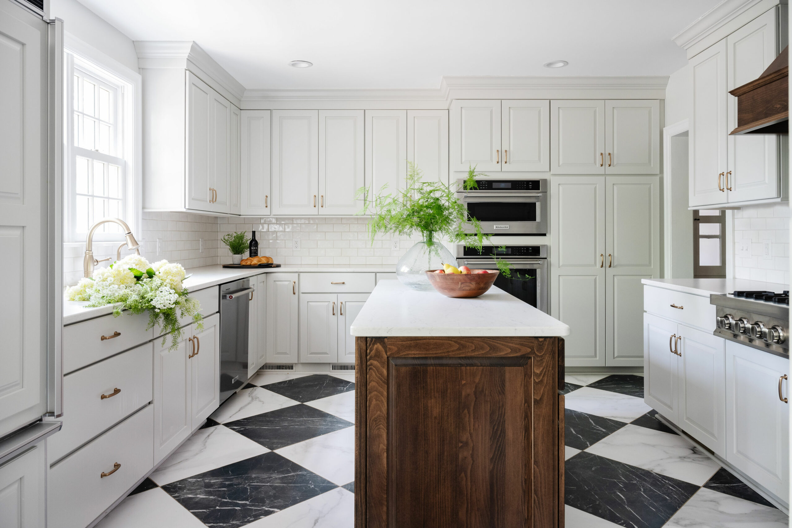
The Rameses and their design team agreed the goals for the kitchen were to allow for better flow and to honor the character and history of the house while incorporating modern amenities.
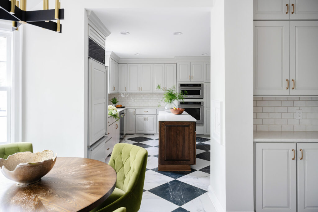
The changes included opening an archway (which Bethanie said made a huge difference) and removing the soffit to take the custom cabinets to the height of the ceiling.

Mary said the kitchen felt really tight before. “We were able to eliminate a peninsula, which created another walkway,” she said. “That allowed us to fit in an island, which they really wanted.”
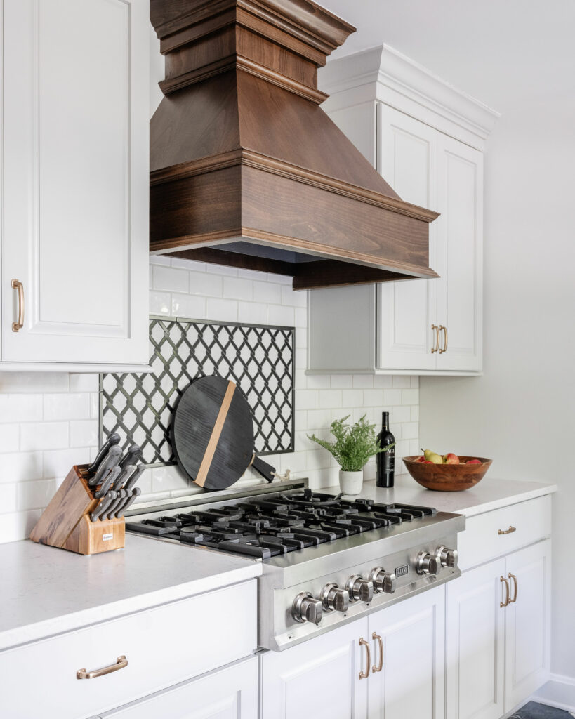
Bethanie said she would have probably gone all white for the cabinetry but Mary encouraged using the wood stain on the island and the hood since there is so much beautiful paneling throughout the house. “Because there was going to be tile on the floor, we needed to tie in the stained wood somewhere,” Mary said.

And about that tile floor–it seems to be everyone’s favorite design aspect. In a nod to the home’s history, Mary chose a classic black and white check in porcelain. “Porcelain is a great option for the marble look without breaking the bank and also ensuring durability,” Mary said.
Bethanie said the floor tile is absolutely perfect. “I love a black and white motif, but I probably wouldn’t have done that without Mary.”
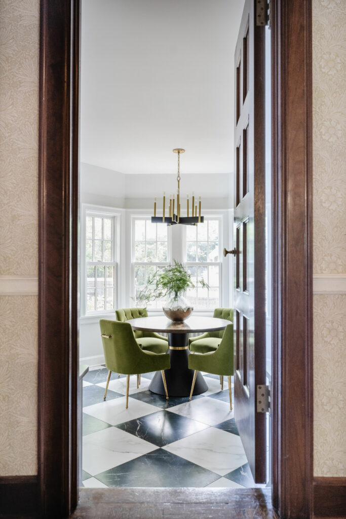
The house was already blessed with a breakfast nook in a bay window. They chose a round table and green velvet chairs with a brass detail that play off the new cabinet hardware. Bethanie said the chairs are a close second favorite in terms of design aspects.

In the end, the Rames family loves their new kitchen and Mary is proud of its design. She said it was a joy for her personally because she loves older homes. “As a designer, I can design to anyone’s style,” she said. “but I don’t often get to work in a house like this. I’d love to do more!”

0 comments